
How To Design A User-friendly Website sets the stage for a detailed exploration of website design principles. Crafting a website that’s intuitive and enjoyable for users is paramount in today’s digital landscape. This guide delves into the key elements of user-friendly design, from defining user-friendliness to testing and iteration, equipping you with the knowledge to create a truly engaging online experience.
This comprehensive guide breaks down the process into manageable sections, covering essential website structure and navigation, visual design and content presentation, and the crucial testing and iteration phase. Understanding the nuances of each stage will help you create a website that not only looks good but also performs well.
Defining User-Friendliness
A user-friendly website design prioritizes the user’s needs and experience above all else. It’s about creating a seamless and intuitive navigation process that allows users to easily find what they’re looking for and accomplish their goals. This includes clear communication, intuitive design, and a focus on minimizing frustration.
A user-friendly website is one where users feel comfortable, confident, and capable of navigating and using the site’s features without extensive effort or confusion. It anticipates user needs and provides clear, concise, and helpful information, thus enhancing overall satisfaction and fostering positive engagement.
Characteristics of a User-Friendly Website
User-friendly design encompasses several key characteristics. It prioritizes clear navigation, straightforward layouts, and easily accessible information. Websites should be easy to scan and understand, even for those unfamiliar with the site’s content.
User-Friendly Features and Design Elements
A well-designed website often includes several features that contribute to a positive user experience. Clear calls to action, intuitive navigation menus, and visually appealing layouts are all crucial. Visual cues, such as highlighting active links or indicating completed tasks, improve usability. A prominent search bar, providing quick access to relevant information, also enhances the user experience. Accessibility features, such as adjustable text sizes and keyboard navigation, further demonstrate user-centric design.
Importance of Accessibility
Accessibility is paramount in user-friendly design. Ensuring the site is usable by people with disabilities is not only ethical but also broadens the potential user base. This includes providing alternative text for images, ensuring proper color contrast, and providing keyboard navigation options. This inclusive approach not only benefits users with disabilities but also improves the overall user experience for everyone.
Usability Principles
Several usability principles guide the design of user-friendly websites. These include:
- Learnability: A website should be easy to learn and use, with clear instructions and intuitive navigation.
- Efficiency: Users should be able to perform tasks quickly and easily, with minimal steps and clicks.
- Memorability: The design should be consistent and recognizable, enabling users to return to the site and navigate with ease.
- Errors: The design should minimize the potential for errors and provide clear error messages.
- Satisfaction: The design should create a positive and enjoyable user experience, fostering a sense of accomplishment and satisfaction.
These principles work together to create a website that is easy to use and remember.
User Experience (UX) Considerations
UX design encompasses the entire user journey, from initial landing to completing a task. Understanding user needs and motivations is crucial. This involves conducting user research, testing designs, and iterating on the design based on feedback. Key aspects include:
- User Research: Understanding user needs and expectations.
- Information Architecture: Organizing content in a logical and easily accessible manner.
- Interaction Design: Creating intuitive interactions between the user and the website.
Considering these factors enhances the overall user experience.
UI Design Approaches Comparison
| Approach | Description | Impact on User Experience | Examples |
|---|---|---|---|
| Minimalist | Emphasizes simplicity and clean design. | Can lead to a feeling of clarity and focus, but may lack visual interest. | Many tech companies, blogs |
| Material Design | Uses layered elements and subtle animations. | Creates a sense of depth and interactivity, often associated with modern design. | Many mobile apps, some websites |
| Flat Design | Emphasizes simplicity and clean lines. | Provides a modern, uncluttered look, but can sometimes lack visual interest. | Microsoft Office 365, many social media apps |
Different UI approaches influence the user’s perception and interaction with the website.
Principles for Different Demographics
Designing a user-friendly website for different demographics requires considering specific needs and preferences.
- Younger Users: Prioritize fast loading times, visually appealing designs, and intuitive interfaces.
- Older Users: Prioritize large font sizes, clear navigation, and easy-to-understand instructions.
- International Users: Ensure multilingual support, cultural sensitivity, and proper localization.
Addressing these factors can significantly improve website usability.
Aesthetically Pleasing and User-Friendly Design
A website should be both aesthetically pleasing and user-friendly. The visual design should enhance the user experience, not distract from it. Visual appeal can be achieved through thoughtful color palettes, typography, and imagery. User-friendliness ensures the site is intuitive and easy to navigate. A balance between these two aspects creates a positive and engaging experience for users.
Essential Website Structure and Navigation
A well-structured website is crucial for user experience. A clear and logical structure facilitates navigation, allowing users to easily find the information they need. This, in turn, boosts engagement and encourages return visits. A poorly organized site, on the other hand, can lead to frustration and abandonment.
A well-designed navigation system is paramount. Intuitive menus and sitemaps serve as guiding paths, helping users understand the website’s content and locate specific pages. A logical organization of content ensures easy access, making the website user-friendly and enjoyable to explore.
Importance of Clear Website Structure
A clear and logical website structure is essential for user navigation. Users should be able to find what they are looking for quickly and easily without getting lost or confused. A well-organized structure ensures that users can access relevant information in a straightforward manner, which improves their overall experience.
Role of Navigation Menus and Sitemaps
Navigation menus and sitemaps act as essential tools to guide users through the website. Intuitive menus, visually appealing and easy to understand, help users quickly locate desired pages. Similarly, sitemaps, often graphical representations of the website’s structure, provide a bird’s-eye view of the entire website, assisting users in navigating through different sections.
Effective Content Organization
Organizing website content effectively is critical for a positive user experience. Categorizing content logically and using descriptive labels for pages and sections helps users quickly identify the information they need. Using clear headings and subheadings helps users scan the content and locate specific information efficiently. Consistent formatting and visual hierarchy contribute to the overall readability and usability of the website.
Creating a Simple and Efficient Navigation System
A simple and efficient navigation system is a key component of a user-friendly website. Employing a clear hierarchy of menus and a limited number of levels will keep the website easily navigable. Use a consistent style for navigation elements, such as colors, fonts, and spacing, to maintain a cohesive look and feel. Consider incorporating search functionality for advanced navigation and quick access to specific information.
Different Website Structures
Various website structures exist, each with its own strengths and weaknesses. A hierarchical structure organizes content in a tree-like format, with main categories branching into subcategories. A linear structure presents content in a sequential order, often used for tutorials or step-by-step guides. A web-based structure allows for dynamic content and interconnected pages.
Navigation Patterns
| Navigation Pattern | Description | Effectiveness | Examples |
|---|---|---|---|
| Hamburger Menu | A three-line icon that expands into a menu when clicked. | Effective for mobile devices due to its compact nature. | Many mobile apps and websites. |
| Tabs | Horizontal or vertical groupings of links that switch between sections. | Good for websites with distinct sections. | Social media sites, news websites. |
| Sidebars | Vertical lists of links, often located on the left or right side of the page. | Effective for websites with many categories. | Blogs, e-commerce sites. |
| Breadcrumbs | A trail of links showing the user’s current location within the website. | Great for providing context and allowing users to easily return to previous pages. | E-commerce sites, content management systems. |
Crucial Elements for a Well-Structured Website
A well-structured website possesses several crucial elements. These include a clear site hierarchy, a user-friendly navigation system, logical content organization, a consistent design, and a fast loading time. These elements contribute to a positive user experience, ensuring easy navigation and information retrieval.
Building a User-Friendly Sitemap
A well-structured sitemap is vital for user-friendliness. Consider these points when creating a sitemap:
- Use clear and concise labels for each page and section.
- Reflect the site’s hierarchy accurately, mirroring the website’s structure.
- Maintain consistency in the structure and formatting of the sitemap.
- Include all essential pages, ensuring no critical content is missed.
- Use visuals, such as diagrams, to improve clarity and understanding.
Visual Design and Content Presentation
A visually appealing website enhances user engagement and comprehension. Effective use of color, typography, images, and layout elements creates a positive user experience, guiding users intuitively through the site. Visual design plays a crucial role in conveying information effectively and making the website memorable.
Visual elements like colors, typography, and images work together to create a cohesive and engaging aesthetic. They contribute significantly to a positive user experience, impacting the overall impression and guiding user interactions. A well-designed website can communicate a brand’s personality and values effectively, boosting user trust and confidence.
Color Palette Impact on User Perception
Color choices significantly influence user perception and mood. A carefully selected palette can evoke specific emotions and create a desired atmosphere. Different colors can signal different functions, and their usage should be purposeful.
| Color Palette | Impact on User Perception | Mood | Examples |
|---|---|---|---|
| Monochromatic (Shades of one color) | Creates a sense of calmness, sophistication, and elegance. | Serene, sophisticated | Websites with a minimalist design, highlighting a single product or service. |
| Analogous (Colors adjacent on the color wheel) | Promotes harmony and creates a feeling of comfort and familiarity. | Relaxed, natural | Blogs, social media pages with a natural theme, showcasing travel destinations. |
| Complementary (Colors opposite on the color wheel) | Can be visually striking and create a sense of vibrancy. | Energetic, exciting | Websites focused on sales promotions, events, or marketing campaigns. |
| Triadic (Colors evenly spaced around the color wheel) | Provides a balanced and lively aesthetic. | Playful, energetic | Websites showcasing a range of products or services, particularly those aimed at a young audience. |
Visual Hierarchy and Whitespace
Visual hierarchy guides users’ attention to crucial information on a page. Proper use of typography, size, color, and spacing can highlight key elements, making content more accessible and easily digestible. Whitespace, the empty space around elements, is crucial for visual clarity and readability. It allows elements to breathe and creates a sense of order and balance.
Effective use of visual hierarchy involves strategically positioning elements based on their importance. For instance, headings should be larger and bolder than body text. Key calls to action should stand out using contrasting colors and shapes.
Typography and Readability
Choosing appropriate typography and font sizes is vital for readability. Legibility and consistency in font selection across the website contribute to a seamless user experience. A clear font choice and appropriate font sizes ensure that users can easily scan and process information.
Using a clear and readable font, such as sans-serif fonts like Arial or Helvetica, can significantly improve readability. Adjusting font sizes based on the context and screen size is essential. A large font size can improve readability on mobile devices, whereas a smaller font size might be suitable for desktop devices.
Image Optimization for User Experience
Optimizing images for loading speed is critical for a positive user experience. Large image files can significantly slow down page load times, leading to user frustration. Compressing images while maintaining quality is essential.
Using appropriate image formats, such as JPEG for photographs and PNG for graphics, can optimize file sizes and loading speed.
Strategies for effective image optimization include using lossy compression techniques for JPEG images and lossless compression for PNG images, ensuring that the image quality remains acceptable. Choosing the appropriate image format, optimizing image sizes, and using web-optimized image formats can significantly improve page loading times.
Concise and Clear Content Writing, How To Design A User-friendly Website
Clear and concise content writing is paramount for user comprehension. Avoid jargon, unnecessary technical terms, and overly complex sentences. Using short paragraphs, bullet points, and headings can improve readability and make information more accessible.
| Method | Description | Example | Benefit |
|---|---|---|---|
| Bullet points | Highlighting key information in concise, easily scannable lists. | * Fast delivery * Affordable pricing * Reliable service |
Improved readability, clear presentation of key details. |
| Headings | Structuring content with clear headings and subheadings. |
Our Mission: How To Design A User-friendly WebsiteOur Team |
Improved navigation, clear organization of information. |
| Short paragraphs | Breaking down large blocks of text into shorter, digestible sections. | We offer a range of services to meet your needs. From basic maintenance to complex installations, we’re here to help. | Improved readability, reduced cognitive load. |
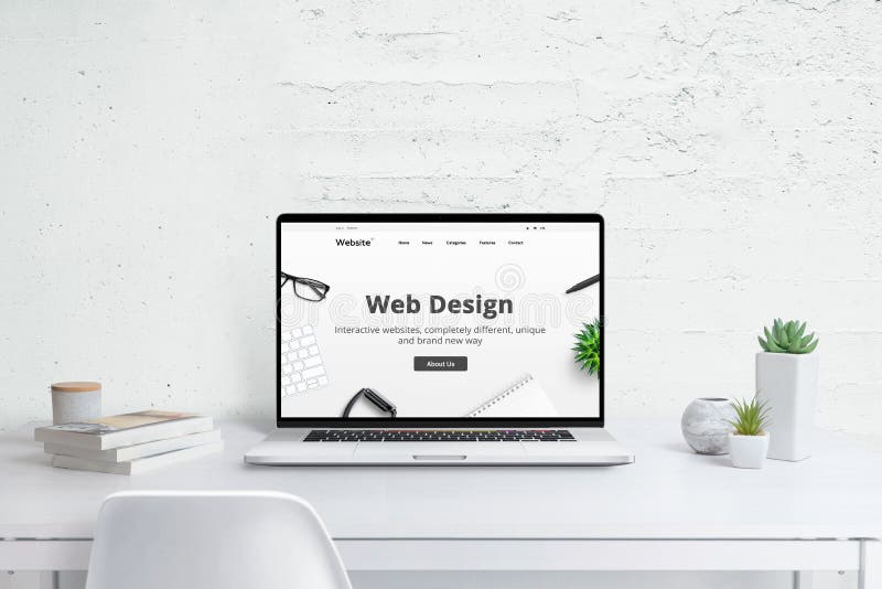
Testing and Iteration

Source: creator.design
Iterative design, incorporating user feedback, is crucial for creating a user-friendly website. This phase refines the initial design based on real-world user interactions, ensuring the final product meets the needs and expectations of the target audience. By testing and iterating, designers can identify pain points, optimize the user journey, and ultimately deliver a more successful website.
Testing and iteration aren’t just about fixing mistakes; they’re about actively shaping the design to resonate with the users. Continuous feedback loops allow designers to make informed adjustments and fine-tune the website to maximize its usability and impact.
User Testing Methods
Gathering feedback from target users is essential for identifying areas for improvement. Various methods can be employed, including usability testing, A/B testing, and surveys. Usability testing involves observing users as they interact with the website, identifying any difficulties or frustrations they encounter. This direct observation provides valuable insights into user behavior and mental models.
Usability Testing
Usability testing is a vital component of the website design process. It directly assesses how users interact with the website, identifying areas where the design could be improved. By observing users as they navigate the site, designers can identify pain points, bottlenecks, and areas of confusion.
Collecting User Feedback
Several methods can be used to gather valuable user feedback. These include:
- Usability testing: Observing users as they interact with the website to identify usability issues and areas for improvement. This can involve having users complete specific tasks on the site and recording their actions and feedback.
- Surveys: Employing questionnaires to gauge user opinions, preferences, and pain points. This is a good way to gather broad feedback from a larger group.
- Interviews: Conducting in-depth interviews to gather qualitative feedback. These interviews allow for a more nuanced understanding of user motivations and needs.
- A/B testing: Comparing two versions of a webpage to determine which performs better. This method focuses on quantifiable metrics like conversion rates or click-through rates.
Analyzing User Testing Data
Analyzing user testing data involves identifying patterns in user behavior and feedback. This involves carefully examining the data to identify recurring issues, common pain points, and areas where users struggle. Key patterns might include high bounce rates on certain pages, users getting stuck on specific tasks, or consistent negative feedback on particular design elements.
Iterative Design Adjustments
Based on user feedback and testing results, the design needs to be iteratively adjusted. This involves a continuous cycle of testing, analysis, and refinement. Identify the most significant areas for improvement, prioritize these, and implement changes.
A/B Testing in Website Design
A/B testing involves presenting two different versions of a web page to different groups of users and measuring which version performs better. This method is invaluable for optimizing design elements like buttons, calls to action, and page layouts. A/B testing allows for a data-driven approach to design optimization. For example, testing two different button colors to see which one leads to higher click-through rates.
Best Practices for User Testing
- Clearly defined goals: Establish specific goals and metrics for the user testing process. This will help in focusing the testing and evaluating the results effectively.
- Representative sample: Recruit users who accurately represent the target audience. This is crucial for ensuring the results are applicable to the intended user base.
- Controlled environment: Conduct testing in a controlled environment to minimize external factors affecting the results. This can involve creating a test lab or providing a structured set of tasks for the users to complete.
- Detailed observation: Carefully observe user behavior during testing. Note any issues or difficulties they encounter, and collect their feedback.
Prioritizing Design Improvements
Prioritize design improvements based on the impact of the identified issues. Consider the frequency and severity of problems, as well as the potential for improvement. A framework like MoSCoW (Must have, Should have, Could have, Won’t have) can help prioritize these improvements.
Ensuring Target Audience Appropriateness
Ensure the website’s design aligns with the target audience’s expectations and preferences. Consider factors like cultural nuances, technical literacy, and overall design aesthetics. This requires a thorough understanding of the target demographic and their needs. Thorough market research and user profiling are essential to create a design that resonates with the intended audience.
Final Conclusion
In conclusion, designing a user-friendly website is a multifaceted process that requires careful consideration of user needs, structure, visual appeal, and iterative testing. By following the principles Artikeld in this guide, you can create a website that not only attracts visitors but also keeps them engaged and coming back for more. Remember, a user-friendly website is key to achieving your online goals.
Essential Questionnaire
What are some common mistakes to avoid when designing a user-friendly website?
Common mistakes include neglecting clear navigation, using overly complex layouts, and failing to consider the needs of diverse users. Poorly optimized images and slow loading times can also significantly impact the user experience.
How can I gather feedback from users to improve my website’s design?
Conducting user testing sessions, collecting feedback through surveys, and monitoring website analytics can help you identify areas for improvement. Tools like user testing platforms can help automate this process.
What are the benefits of a well-structured website?
A well-structured website improves navigation, making it easier for users to find the information they need. This translates to higher user satisfaction and potentially increased conversions.